Future-Proof Your Brand: A Guide to Branding and Design in 2025 and Beyond
Are you feeling the pressure to keep up with the ever-evolving world of marketing, where the options keep changing and the success rates of different platforms are always shifting?
Do you juggle multiple responsibilities, leaving little time to strategically grow your brand?
You’re not alone. Many businesses, from small start-ups to established enterprises, are grappling with similar challenges. This blog is a quick guide to help you navigate the complexities of branding and design, with a focus on practical strategies that deliver real results, helping you grow your customer base, grow sales, and increase your brand awareness, all while being mindful of your precious time and resources.
The Importance of a Rock-Solid Brand Identity
Your brand identity is more than just a logo; it’s the heart and soul of your business. It encompasses everything from your visual elements (logo, colours, fonts) to your brand voice, messaging, and overall values. A strong brand identity fosters recognition, trust, and loyalty, ultimately driving customer acquisition and retention.
In the crowded marketplace, a clearly defined brand identity will be the key differentiator. It’s your promise to your customers; a promise you need to consistently deliver on. This isn’t just about pretty visuals – it’s about aligning your visual presence with your company mission and providing a cohesive experience for every customer touchpoint, online and off. Think about it – how do you want people to feel when they interact with your business?
Marketing mistakes: if you’re a business who uses coupons, promotions, or special offers to incentivize purchase (i.e. this is part of your pricing or promotional strategy), ensure that your team are on board with the offer too.
You’ve probably overheard, or experienced customer-facing staff argue over the validity of an offer or deliver sub-par service once a discount is applied. The opposite needs to be true…comms with your team are equally important around the ‘offer’ because they are the front-people who should be creating a memorable experience for what is often a new customer opportunity with a longer lifetime value than this one encounter.
Remember: your customers will also tell their friends, family and colleagues about their experience. Positive internal communications around the ‘offer’ + ongoing reminders around company values and culture can build brand equity in a powerful way. On the flip side, ineffective management of ‘promotional offers’ has the potential to deliver a negative brand experience…the opposite effect that you’re likely after.
Brand identity flows into customer experience. Be equally awesome with your full paying AND your coupon customers.
Crafting or updating a Memorable Logo: An Impression that Lasts
Your logo is the face of your business – it’s generally one of the first visual cues potential customers / clients encounter. A memorable logo should be simple, impactful, and timeless. Avoid trends that will quickly date your brand. Consider these aspects:
Simplicity
A clean, uncluttered design is easier to remember and reproduce across different platforms.
Dropping the F-bomb & kerning: Kerning is the spacing between letters / characters. It supports readability and is useful for design & aesthetics. If you’ve ever seen the word ‘flick’ represented in an upper-case font with tight kerning, you likely did a double take (try typing it for yourself and see what we mean).
So, when you’re thinking about simplicity, also think about readability, legibility, and of course appeal…no one wants a hideous logo hanging around for years.
Relevance
The design should reflect your brand’s values and resonate with your target audience. This also holds true if you’re selecting the brand or business name. If the design or name is going to require extensive explanation think about whether this is a risk you’re comfortable with and have the budget to manage (disconnected visual brands and names often require extra marketing budget to manage extra multi-channel promotions to educate the market on a confusing name choice in addition to general promotions to drive sales).
Tip / Permission Statement: Avoid asking your Board of Directors for their opinion on your new logo design or colors unless they are incredibly in-tune with your target audience and can park their personal preferences (or it explicitly states in your Delegations of Authority or some other policy that they get to workshop and operationally contribute to this decision). Final endorsement is great, but focus on gathering feedback from your actual customers and decision-making influencers…they are the real people you want opinions from.
(Yes, you can show this to your Board….and if they challenge you, connect them with our CEO 😉 …she’s had this conversation with Directors before)
Versatility
Ensure your logo scales well, working effectively on various sizes, from your website banner to a business card. If you’re planning on reproducing your logo across print and digital mediums consider whether a color-gradient can be reproduced well, look at font sizes for readability from near and far.
Tip / Be sun-smart: Considering UV radiation isn’t just for days at the beach. When you’re logo planning and you intend to add your logo to outdoor signage or vehicles for example, consider your color palette and how specific colours fade over time. Reds, yellows, and even blues fade faster than other colors. You don’t need to rule them out, but you should consider whether your future budget will allow you to replace these outdoor representations of your logo
Uniqueness
Strive for a design that distinguishes you from competitors, avoiding clichés and generic imagery.
Small business logo tip: We’ve worked with small businesses on visual rebrands, and one of the elements we recommend is a logo design that has a removable tagline or strapline tucked in with the logo.
Why do we recommend this? Well, a good tagline will explain your benefits or what you offer (in a nutshell), which is important when your business name or logo generally won’t convey all you do. Small businesses generally have limited budgets for marcomms (i.e. less opportunities to promote your brand, educate the market, etc.), so considering a tagline or strapline at the point of creating or updating a logo is a smarter way to support increased engagement with your brand.
A quick case study on logo colors
Although it’s great to stand out from the crowd, think about whether you have the risk appetite to buck the trends in your industry, or chase colors that typically evoke emotions contrary to what your brand and business is all about.
There’s a whole school of thought around the psychology of colors, and this summary from Adobe gives a great insight into the feelings created by color.
One of the brands we work with – The Marketing Box – had an interesting logo refresh journey, five years after they started. Their first logo contained a deeper red tone with a suite of other secondary colours. During the logo refresh project, they decided to keep a version of red in their logo to demonstrate authority, purposefulness, and enthusiasm (they felt they were important elements of their service delivery). In response to this, the graphic design team found a shade of red with warm, watermelon-esque tones.
At the same time, The Marketing Box were updating their website and had follow-on decisions thanks to their logo change. The web design team carefully used charcoal, white, and full color photos, interspersed with the new ‘red’ logo colour. They were careful to avoid large blocks of red which can evoke a sense of anger. This is a great example of a small to mid-sized business using some simple color thinking to guide their logo and website visual design. You can check out their site at www.themarketingbox.com
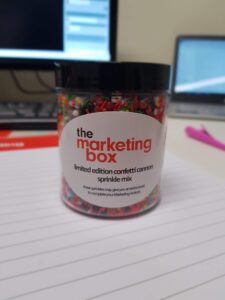
A great example of logo colors and secondary colors in use
(And in case you’re wondering, no, they didn’t have outdoor signage so their color choice of ‘reds’ didn’t need to factor in UV damage. They did however consider matching their logo color with candy + sprinkles, because their founder was quirky and liked unusual marketing merchandise).
The key is choosing a visual language consistent with your overall branding strategy. Think about what feelings you want to evoke – is it trust and reliability, innovation and excitement or perhaps approachability and warmth? Your logo should translate this.
Consistent Brand Messaging: ‘Speaking’ with One Voice
Consistent messaging is vital for building a strong brand reputation. This means aligning your voice and tone across all communication channels – your website, social media, email marketing, even your packaging. Inconsistency confuses customers, eroding trust and diluting your brand’s message. It’s crucial to define your brand’s personality: Are you formal and professional? Casual and friendly? Humorous and quirky? Choose a tone of voice that genuinely reflects your brand and remains consistent across all communications.
For Business to Business (B2B) & Business to Government (B2G) organizations, this often translates to authoritative and informative content demonstrating expertise. Your messaging shouldn’t simply promote products or services. Establish yourself as a thought leader by consistently creating valuable content like blog posts, white papers, or case studies addressing challenges facing your target market. (This blog post itself is an example of educating the market and positioning Amplifyo as a thought leader. See what we did there?)
Some Business to Consumer (B2C) businesses generally have a little more freedom with their tone of voice, depending on who their target audiences are. One of my favourite cupcake suppliers talk about sating your inner princess or rewarding oneself for the daily dragon fights, on their website. When you purchase a box of their cupcakes there’s a quirky note about caring for your cupcakes when you take them home (personifying the cupcakes!). From website ordering to cupcake design and the take-home experience, there’s a clear quirky brand tone that celebrates this sweet treat as a reward.
Beyond the Basics: Preparing Your Brand for 2025
While logo design and messaging are fundamental, success in 2025 necessitates adaptability. Consider these factors:
Digital Transformation
Embrace digital marketing wholeheartedly. Explore interactive content, data-driven strategies, and personalised marketing. The internet is evolving continuously – your brand must keep up to ensure customer engagement. This includes a fully optimised and user-friendly website across various devices.
Sustainable Practices
Sustainability is increasingly important to consumers. If your brand values environmentally friendly approaches, make sure it’s reflected in your design choices (e.g., sustainable materials for print) and marketing messages.
Accessibility
Design your branding materials to be accessible to all. Use appropriate font sizes, colour contrasts, and alt-text for images to make your website and other materials inclusive.
Font Feelings: For many years I’ve silently judged people and organizations who use Comic Sans font in their publications. That changed when I was doing some research on accessible & inclusive communications and discovered that Comic Sans font is in fact recommended by organisations like the British Dyslexia Association as the font is easier to read due to the rounded edges on each letter, and the wider spacing.
I’ll still silently judge you if you recklessly use Comic Sans without an accessibility purpose, but I’m all for making communications easier for others with the use of a bulbous font.
Click here to read more about Creating accessible and inclusive communications
Data Analytics
Use data analytics tools to track brand performance and measure the effectiveness of your campaigns. Adaptability relies on a willingness to analyze and refine approaches as needed.
Brand thinking: it’s not rocket science, but it has degrees of technical thinking. It’s a healthy activity to review and evolve your brand fundamentals and implement future-proof strategies, to positioned your business for stronger connection with customers today, and into the coming year.

